WordArt, Kinko's, and Pure Grease: Why the Ugliest Flyer in the Stack Always Fills the Room
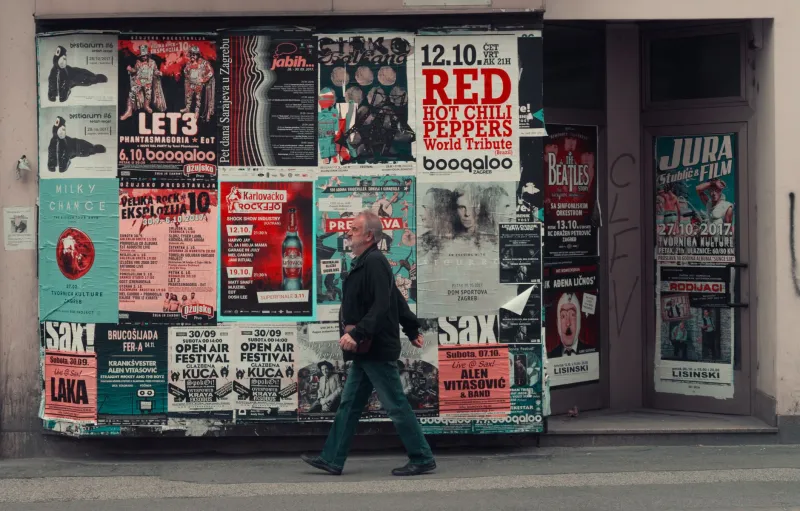
There's a flyer taped to the wall of the Green Parrot in Key West that looks like a ransom note designed by a guy who just discovered the 'bevel' tool. Comic Sans headline. A trumpet clip-art photo that's clearly been photocopied so many times it's more ghost than horn. Show time listed as '9-ish.' That flyer sold out the room.
We know because we've played rooms with flyers like that. And we've played rooms with flyers that cost more than our gear budget — agency-approved, brand-consistent, gorgeous. Guess which crowd showed up ready to sweat.
The Uglier the Flyer, the Hotter the Grease
Here's the theory we've been kicking around the van for twenty years: a polished flyer promises a product. A janky flyer promises a party. When a promoter spends forty bucks and a lunch break wrestling a Kinko's self-serve machine, that effort reads as sincerity. Nobody fakes a drop shadow that bad for money. They fake it for love.
Funk audiences can smell marketing the way they can smell a backing track. The whole genre runs on the opposite of polish — the cracked note, the bass player's amp dying mid-song, the horn section arriving late and making it everyone's problem. So when the flyer looks like it was made by an actual human with actual problems, the crowd trusts it. The ugliness is proof of life.
WordArt Is a Honky-Tonk Language
Think about the canonical bad funk flyer. There's always a flame gradient. There's always a font that looks like it's melting, which, honestly, tracks — funk is supposed to look like it's melting. There's a phone number to call for 'tix and info,' because this flyer predates or ignores the internet entirely. And there's always a billing order that makes no sense, with the local opener's name bigger than the headliner's because the opener's cousin printed it.
That's not incompetence. That's a folk art tradition as legitimate as the quilts of Gee's Bend. Every city's got its own dialect, too. Chicago flyers from the '90s are all bold condensed type and Xeroxed faces. New Orleans flyers lean on second-line imagery even when the gig is a five-piece funk band in a bar on Rampart. The flyer tells you what neighborhood you're walking into before you get there.
Confessions From the Kinko's Front Lines
We called up a few promoters who made these things, expecting embarrassment. We got defiance.
Denny Okafor, who booked rooms in Columbus for two decades, told us his secret: 'I'd print everything at 2 a.m. when the self-serve machines were empty and the night manager didn't care how many times I ran the same sheet through the color copier to get the red to pop. Those flyers looked like they'd been through a war because they had. Me versus that machine, every Tuesday.'
Maria Delgado, who ran a small club in San Antonio, put it sharper: 'The ugly flyer is honest. I don't have a designer. I have a nephew with CorelDRAW and a dream. When people see that flyer, they know exactly what the night's gonna be — loud, loose, and nobody's checking a soundcheck. That's the product. Why would I advertise a steak dinner?'
And a guy named Tuck in Memphis, who wouldn't give a last name, said the whole thing in one line: 'If the flyer's too pretty, folks figure the cover's too high.'
He's right. There's a direct correlation in our experience between flyer polish and door price, and the crowd does that math faster than any algorithm.
The Slideshow: A Museum of Beautiful Crimes
We've assembled a gallery of the greats, and we mean that sincerely:
- 'FUNK-A-THON 88' — Detroit. Chrome lettering on a starburst background, with a photograph of a Cadillac that may or may not belong to the band. Legend says the car was stolen before the show and the flyer was never corrected.
- 'LADIES FREE BEFORE 10' — Houston. The band name is in a font called Bazooka. The 'FREE' is roughly forty times larger than any other element. Priorities, clearly stated.
- The flyer with the wrong date — Atlanta. Printed for a Friday show, hand-corrected with a Sharpie to Saturday, photocopied again, staple-gunned over the original. Three layers of correction visible on the telephone pole outside the club. It's the most honest document in American music.
- 'ALL YOU CAN DRINK' with the price in small type — St. Louis. A flyer that is technically a legal disclaimer.
The Algorithm Can't Staple
Look, we run our own socials. We know what a boosted post does, and we're not Luddites. But a boosted post is a whisper to ten thousand people who mostly scroll past. A bad flyer on a telephone pole is a shout to four hundred people who live within six blocks of the bar and are bored on a Thursday.
The flyer also does something the feed can't: it stays. That flyer at the Green Parrot has outlived three owners of the club. People photograph it. It becomes part of the room's history. Try getting a Story to do that — it's gone in a day, along with whatever engagement it generated.
So here's our ask, promoter to crowd: keep making them ugly. Keep the melting fonts and the clip-art horns and the billing order that makes no sense. Keep the Sharpie corrections, because those are the fingerprints of a scene that actually exists.
And if you're putting our name on one? Make it big, make it crooked, and for the love of the pocket, use the flame gradient. We've earned it.